Creating the GTA VI logo in SwiftUI
Ever since Rockstar Games released the trailer for GTA VI, there has been much exuberance over the latest installment in the long beloved franchise.

My way of jumping onto the bandwagon though I no longer game as much, was to take a shot at recreating the logo in SwiftUI. While at first it seemed like it was going to be easy, just assemble the letters V & I and drop some colors and add some images; it was anything but.
Right off the bat, using letters did not work atleast for the letter V because none of the fonts I played with matched the depth of the upper-cut v in the letter.
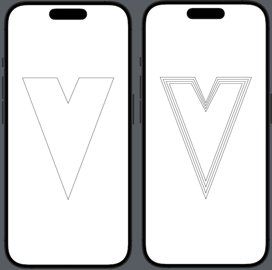
The second issue was that if you look closely, the V in the logo was not just one but 3 V’s each with slightly different gradients overlayed onto each other. Achieving this using letter text was not a feasible approach. This meant I’d have to draw the V from scratch as a Shape and then overlay it which again required scaling each upper V correctly but this threw out alignment quite a bit.
This is where InsettableShape came in to the rescue! According to the official documentation an InsettableShape is:
A shape type that is able to inset itself to produce another shape.
protocol InsettableShape : Shape
Also since it conforms to Shape it was a no brainer.
After some required calculations (thanks StackOverflow folks) I was able to go from one V to three V’s, hurray!

Using the digital color meter app on Mac I was able to pick colors from the official logo, create gradients & apply them to complete the V shape part. Drawing the I was fairly easy using the default Rectangle shape with some padding applied and finished off with gradient fills.
Next came the most difficult part, finding a palm tree image I could use. And trust me, it was actually very difficult to find a watermark free, free for personal use image. I ended up getting a colored palm tree with the branches spread out enough so as to use for the logo, although it came in green color. Changing the color to black required no elaborate Photoshopping thanks to the colorMultiply(_:) modifier using black color.
However, overlaying these palm images after some rotation and vertical flipping presented another problem. The images were overflowing the topmost letter shapes and spilling all over my lovely gradient fills. To solve this I used the clipShape() & clipped() modifiers with our previously created shapes in order to keep the palm tree images contained within the topmost shapes.
The final part was to add the Grand Theft Auto text in Rockstar Games’ signature font style. There were 2 ways to tackle this, one was to use the readily available Pricedown font and the other was to just grab a free to use logo off the web. I decide to go with the logo route here because the font doesn’t exactly match the text as the letter R for instance extends further at the bottom and didn’t work well unless I did some custom clipping. There are other letter’s too that would need work to get them to look like the letters in the actual logo.
A minor hurdle was to now apply a gradient stroke to the text logo and this was not trivial as well. You see, there isn’t a standard way to stroke texts, much less images in SwiftUI. One of the options was to apply repeated shadows with varying radii but that left a sort of glowy effect. After many attempts at coming up with a suitable solution I chanced upon this StrokeModifier answer on SO that came the closest to solving this problem. I was able to update the modifier to use a gradient instead and complete the logo.

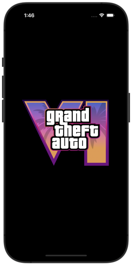
All things considered, I think I did pretty well.
And that’s it! The complete code can be found here.
Leave a comment if you have any questions and share this article if you found it useful !
